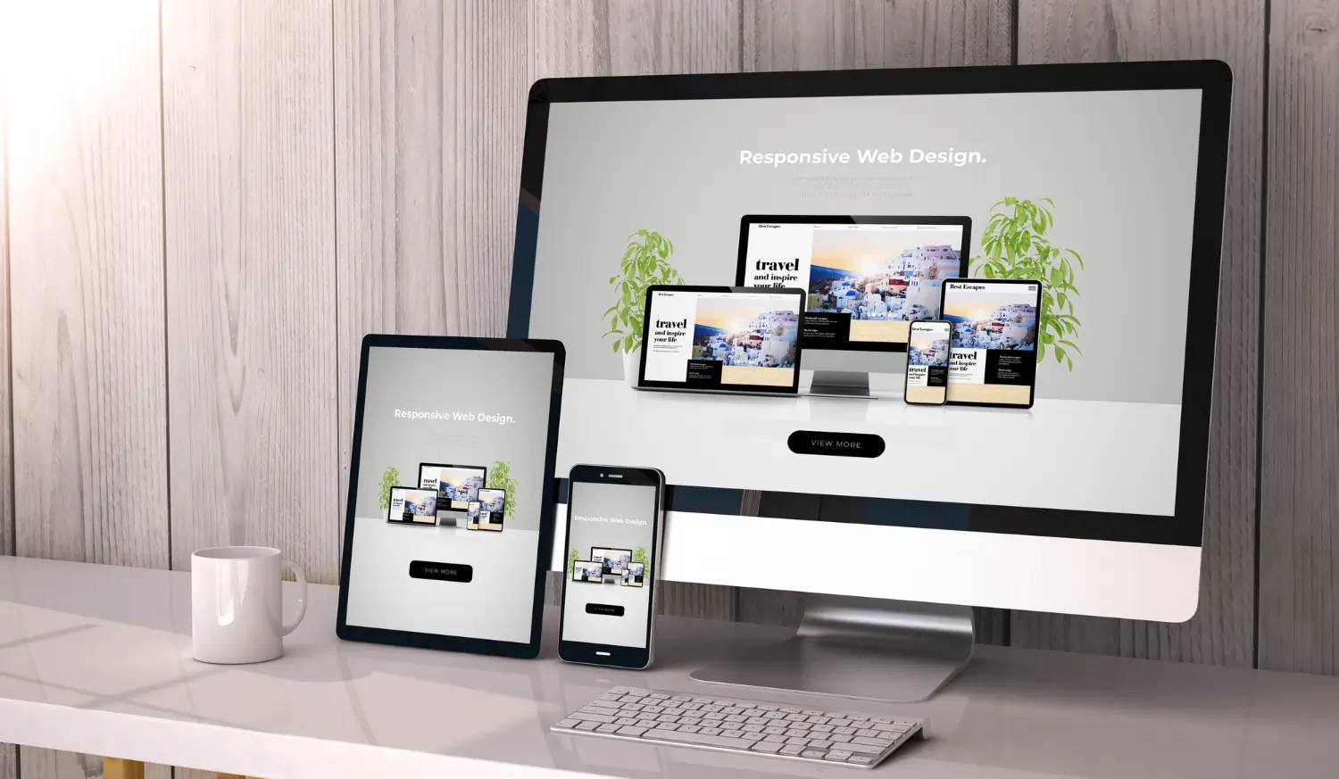
In the realm of design, color is a vital component of the psychological impact of your design on the viewer. In other words, one can say color is the secret messenger of determining the right choice when it comes to user experience. It says that you only take 90 seconds to make a first impression on the product, and it is solely based on the usage of color. Let’s see what magic color aesthetics can do to enhance the quality and productivity of your design!
1. A Palette for Brand Identity
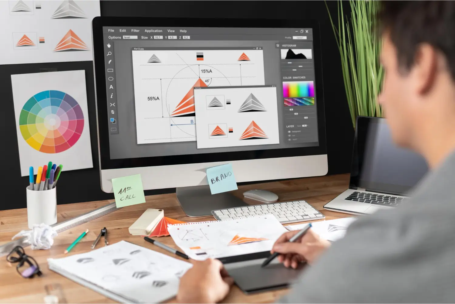
When designing the brand identity and logo of your company, color is the most important thing, as it is the first thing the customer gets to interact with. Think of famous worldwide brands; when you think of Facebook, you think blue; when you think of Starbucks, you think green; and when you think of McDonalds, you think of yellow arches. On Facebook, blue is throughout the user experience – the logo, accents, and the website. Starbucks is associated with green, as their stores, packaging, website, apps, and employee uniforms are designed according to the same colors.
2. A Palette of Emotions
Color theory holds the prominent ability to evoke specific emotions which can’t be done alone with just a logo. A brand needs to cultivate emotions in the consumer’s mind, as how the brand feels matters more than what it makes you think of. That’s why a designer needs to play smoothly with colors, as emotions are always powerful enough to drive – decision-making and visual communication. Before determining the brand colors, you must have an understanding of the brand identity and its personality. Here are a few major web design colors and their implied messages.
Red
Orange
Yellow
Green
Light Blue
Dark Blue
Purple
Pink
Brown
White
Black
Grey
Subdued, classic, responsible, dependable, serious, mysterious, and mature; neutral, serious, and professional.
3. A Palette of Attraction
To begin with, every individual has a unique visual perception, which makes it impossible to catch a single color that attracts all. Moreover, people’s preferences in color can be based on age, gender, culture, and even weather! Imagine that a kid would very much like to color with red, orange, and bright yellow, while an adult would much more like to use green, black, and dark blue.
Yet, designers can do wonders with colors when they comprehend how color preferences can be biased by various facts. Let’s read the conclusions below about how color preferences vary according to gender, drawn from a deep study conducted on this topic.
- Blue is the most preferred: Among both men and women, blue has been voted as the favorite color, surprising marketers who believed women were more likely to be interested in pink.
- Brown and Orange as ditched ones: Men disliked brown, while women showed less preference for orange.
- Cool shades take the lead: Cool color tints in general were preferred by both men and women, dominating blue and green.
- What has been most admired: Women admired the gentle hues of tinted colors, while men preferred pure or shaded colors.
- Simplicity and versatility in action: This study found that men prefer neutral colors, which are achromatic colors like white, black, and gray.
4. How to use color in designs?
Know your audience
This refers to the information like targeted audience’s preferences, cultural influences, and psychological responses to colors of the targeted audience in designing and branding. Knowing your audience involves identifying specific tastes and expectations of the intended audience.
Contrast is the KEY
In color designing contrast refers to the distinction among elements in a piece of work in terms of their hues. With no further hassle, let’s see it with an example. The Button Color A/B Test conducted by Joshua Porter a few years ago is a fine example of why color standing out matters. Joshua compared the alteration of two versions of colors on the same landing page with call – to – action buttons. The only difference between the A and B samples was that A was green and B was red. Most of us would think green would perform better; even Joshua himself predicted that. But red stood out with 21% more clicks than green. The reason was that red is more likely to grab attention as it stands out on the page. So if you want to engage your viewer with the design, contrast can be a special element!
Evaluate your color choices
No matter how perfect your design is to you, it might not go well with the eyes and choices of the audience. That’s why, when designing for a diverse audience, it is important to test your color selection by using the earlier – mentioned A/B test method or getting feedback from the targeted audience. You can go with questions like,
- What was the first thing you noticed about this design? What made you want to interact with design?
- Rate from a 1-5 scale how does this design make you feel?
- Why do you think you want to purchase this product or service?
Accessibility of color aesthetics
Color accessibility can directly impact the user experience. By welcoming an accessible color palette, the designer can take into consideration how the design may affect the color blind and viewers with low – vision. It says that approximately 8% of men and 0.5% of women suffer from color blindness. So it is important to be aware of the audience you are going to interact with.